
Most American sports bettors using traditional spreadsheets never see half the patterns hidden in plain sight. With NBA and NFL analytics growing more complex every year, only bettors who turn massive datasets into smart visual models stay ahead. Cutting-edge data visualization transforms abstract stats into instant, actionable views that catch subtle shifts and potential value bets. Uncover the power behind clear graphs and interactive dashboards to reshape your betting strategy with deeper precision.
Table of Contents
- Defining Data Visualization for Betting
- Types of Visual Models in Sports Betting
- How Visualization Reveals Hidden Betting Value
- Integrating Graphs and Dashboards Into Strategy
- Common Visualization Pitfalls for Bettors
Key Takeaways
| Point | Details |
|---|---|
| Data Visualization Enhances Decision-Making | Visual tools like heat maps and scatter plots make complex betting data easier to analyze, leading to more informed strategic decisions. |
| Interactive Dashboards Provide Real-Time Insights | Advanced dashboards enable users to assess live data, offering immediate updates on odds and performance metrics for quicker reactions during betting scenarios. |
| Beware of Visualization Pitfalls | Critical examination of graphics is essential; misleading representations can lead to poor betting choices if axis manipulation and cluttered visuals are not avoided. |
| Focus on Predictive Models for Value Bets | Utilize advanced visualization techniques that integrate predictive analytics to uncover hidden betting value that traditional analysis might miss. |
Defining Data Visualization for Betting
Data visualization transforms complex betting information into clear, actionable graphics that enable smarter strategic decisions. At its core, this approach takes raw statistical data and translates it into intuitive charts, graphs, and interactive displays that quickly communicate critical insights about sports betting scenarios. Academic research data visualization reveals how graphical representations can uncover hidden patterns that raw numbers often obscure.
In sports betting, visualization techniques like heatmaps, trend lines, and comparative scatter plots allow bettors to rapidly process massive datasets about player performance, team statistics, historical matchups, and probability models. These graphical tools help transform complex numerical information into strategic intelligence that can identify value bets, predict potential outcomes, and understand risk factors more comprehensively than traditional numerical analysis. Using visualization to reveal insights enables faster decision making by presenting large datasets in comprehensible formats.
The most powerful data visualization strategies in betting go beyond simple bar graphs or pie charts. Advanced techniques incorporate interactive dashboards that dynamically update based on real-time data, allowing bettors to explore multiple scenarios instantly. These tools might track live odds movements, display probability distributions for specific game events, or compare historical performance metrics across different teams and players. By converting raw statistical information into visually engaging formats, bettors can make more informed choices and develop more nuanced betting strategies.
Pro Tip: When exploring data visualization tools, prioritize platforms that offer customizable dashboards and real-time updating capabilities to maximize your strategic insights.
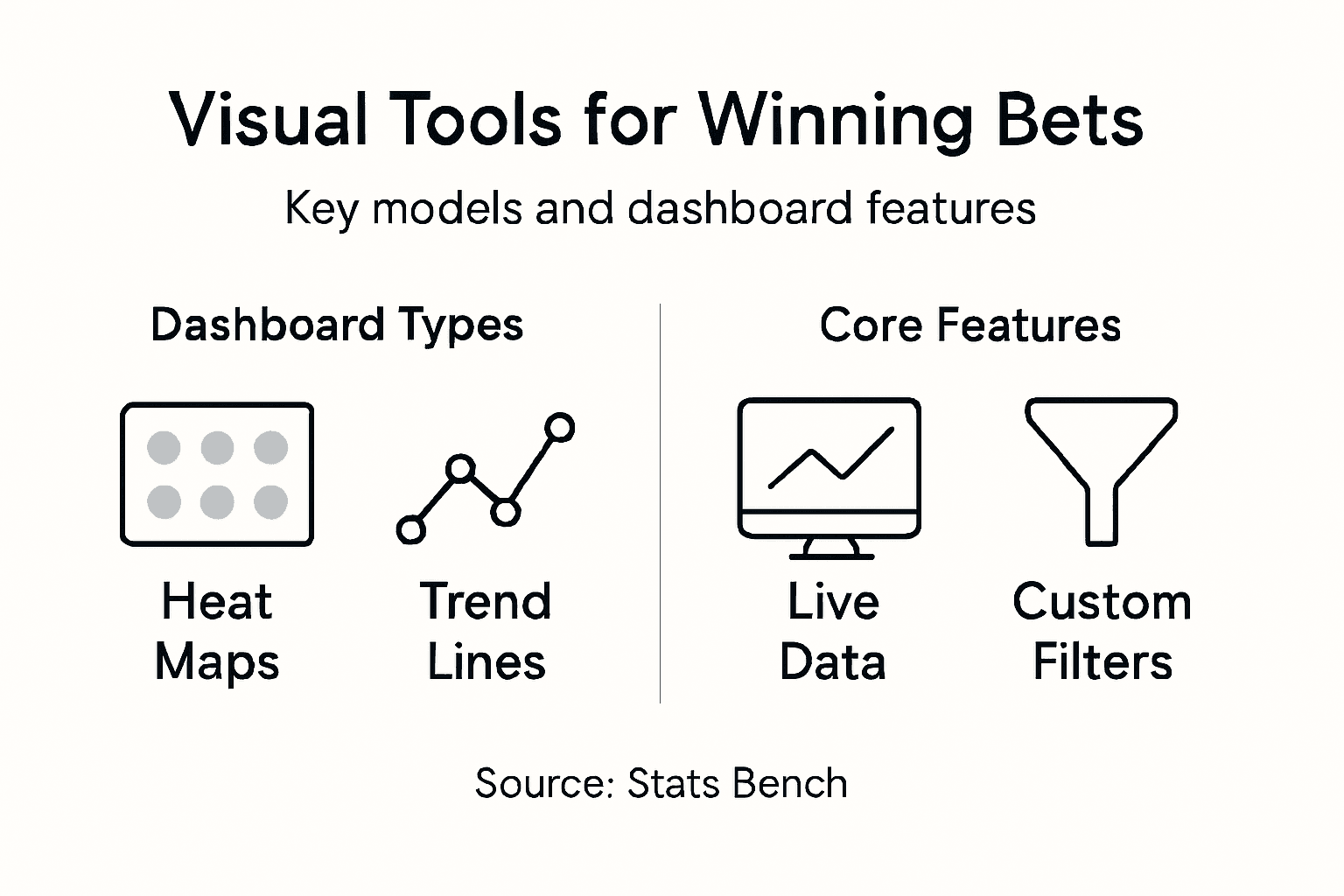
Types of Visual Models in Sports Betting
Sports betting data visualization encompasses several sophisticated visual models that transform complex statistical information into actionable insights. These graphical representations range from basic charts to advanced interactive dashboards, each designed to help bettors understand probability, performance trends, and potential value bets. Machine learning techniques have significantly enhanced these models, enabling more precise predictive analytics across different sports and betting scenarios.
The primary visual models in sports betting include heat maps, comparative scatter plots, trend lines, probability distribution graphs, and live odds movement charts. Heat maps can quickly display team or player performance across multiple dimensions, using color intensity to represent statistical strengths or weaknesses. Scatter plots help bettors visualize correlations between different performance metrics, such as a player’s scoring consistency versus defensive rating. Trend lines track historical performance trajectories, allowing bettors to identify emerging patterns or potential regression in team or individual athlete performance.

More advanced visualization models integrate real-time data processing capabilities, creating dynamic dashboards that update instantly based on in-game events. These interactive tools might display live win probability calculations, track momentum shifts, or simulate potential game outcomes using complex algorithmic models. By presenting massive datasets in intuitive, visually engaging formats, these models enable bettors to make faster, more informed decisions and develop more sophisticated betting strategies that go beyond traditional statistical analysis.
Pro Tip: Invest time in learning how to read and interpret different visual models, focusing on understanding the underlying data relationships rather than just surface-level graphics.
Here’s a comparative overview of major visualization techniques used in sports betting:
| Visualization Type | Main Purpose | Typical Use Case |
|---|---|---|
| Heat Map | Showcase performance intensity | Reveal team strengths/weaknesses |
| Scatter Plot | Identify correlations between variables | Compare player metrics |
| Trend Line | Track historical changes | Spot patterns in results |
| Live Dashboard | Monitor real-time data updates | React to in-game events quickly |
| Probability Distribution | Show outcome likelihoods | Assess win/loss odds |
How Visualization Reveals Hidden Betting Value
Data visualization serves as a powerful lens for uncovering betting opportunities that traditional numerical analysis might miss. By transforming raw statistical data into intuitive graphical representations, bettors can identify subtle patterns and market inefficiencies that provide a competitive edge. Betting analysis through visualization enables deeper insights by revealing correlations and trends that are not immediately apparent in raw spreadsheet data.
The true power of visualization lies in its ability to expose complex relationships across multiple performance dimensions. For instance, a scatter plot might reveal that a basketball player’s scoring efficiency drops dramatically in away games against teams with specific defensive configurations. Heat maps can highlight momentum shifts in football teams, showing how performance varies under different weather conditions or after specific strategic changes. These visual models transform abstract numbers into actionable intelligence, allowing bettors to spot value bets that traditional handicappers might overlook.
Advanced visualization techniques go beyond simple charts by incorporating predictive modeling and real-time data integration. Interactive dashboards can now simulate potential game scenarios, track live performance metrics, and adjust probability calculations instantaneously. This dynamic approach enables bettors to make more nuanced decisions, identifying betting opportunities that emerge from complex data interactions. By understanding these visual patterns, sophisticated bettors can develop strategies that exploit market inefficiencies and generate consistent long-term value.
Pro Tip: Develop a systematic approach to reading visual models by comparing multiple visualization techniques and tracking their predictive accuracy over time.
Integrating Graphs and Dashboards Into Strategy
Successful sports betting requires a systematic approach to data integration that goes beyond simple statistical tracking. Data-driven sports betting strategies leverage comprehensive dashboards that synthesize multiple data streams, transforming raw information into actionable betting insights. These advanced visualization tools enable bettors to move from reactive decision-making to proactive strategy development by presenting complex performance metrics in intuitive, real-time formats.
The most effective dashboards integrate diverse data sources, combining historical performance data, live game statistics, player fitness metrics, and predictive probability models. A sophisticated dashboard might simultaneously display a quarterback’s performance under different weather conditions, the team’s recent defensive ratings, and real-time injury updates. By presenting these interconnected data points visually, bettors can quickly identify potential value bets that traditional analysis might overlook. Scatter plots can reveal nuanced performance correlations, while heat maps can highlight momentum shifts and strategic advantages that are invisible in raw numerical data.
Advanced betting strategists use interactive dashboards as dynamic decision-making tools, not just static information displays. These platforms allow users to customize data views, simulate potential game scenarios, and adjust predictive models in real time. Machine learning algorithms can now automatically highlight emerging patterns, suggest potential betting opportunities, and provide risk assessments based on complex multi-variable analyses. This approach transforms data visualization from a passive reporting tool into an active strategic asset that continuously refines betting methodologies.
Pro Tip: Develop a personalized dashboard template that includes your most critical performance indicators, and consistently update your visualization approach based on predictive accuracy tracking.
Common Visualization Pitfalls for Bettors
Data visualization can be a powerful tool, but it can also lead bettors astray when not approached carefully. Statistical pitfalls in data visualization can create dangerous illusions that undermine betting strategies. Common mistakes like manipulating chart axes, using misleading aggregates, and ignoring critical context can transform what appears to be a promising insight into a catastrophic betting decision.
One of the most prevalent visualization errors is axis manipulation, where chart scales are deliberately adjusted to exaggerate or minimize performance trends. A graph might make a 5% performance variation look dramatic by truncating the y-axis, creating a false perception of significant change. Similarly, bettors often fall into the trap of using inappropriate averages that mask underlying variability. A team’s overall win percentage might look impressive, but this single number could hide crucial performance inconsistencies across different game conditions, opponent types, or player configurations.
Advanced bettors must be vigilant about visualization errors in betting analysis. This means critically examining visual representations for potential biases, understanding the complete context behind each graphic, and avoiding overcrowded or cluttered visualizations that obscure key insights. Color selection, data point density, and the choice of chart type can significantly impact how effectively a visualization communicates complex betting information. Successful data-driven betting requires not just accessing visual tools, but developing a sophisticated ability to interpret them accurately and critically.
Pro Tip: Always cross-reference visualization insights with raw data and maintain a skeptical approach to any graphic that seems too simplistic or dramatically skewed.
Here are common visualization pitfalls and how to avoid them in sports betting analysis:
| Pitfall | Why It’s Harmful | How to Avoid |
|---|---|---|
| Manipulated Chart Axes | Distorts trends, creates false insights | Always verify axis scales |
| Overreliance on Averages | Masks variation and key outliers | Analyze segmented stats |
| Cluttered Graphics | Obscures critical details | Prioritize clear, simple visuals |
| Misleading Color Choices | Confuses data relationships | Use distinct, logical colors |
| Ignoring Context | Leads to misinterpretation of results | Cross-reference with raw data |
Unlock the Power of Data Visualization to Elevate Your Betting Strategy
The article highlights the challenges bettors face in translating complex sports data into clear, actionable insights. Many struggle with interpreting visual models like heat maps and scatter plots while avoiding common pitfalls such as misleading graphics and overlooked context. If you want to move beyond gut feelings and develop a winning approach based on rigorous analysis of probabilities and real-time events, embracing advanced data visualization is essential.
Stats Bench bridges this gap perfectly by offering comprehensive analytical models that process thousands of data points daily to identify hidden Positive EV opportunities you won’t find elsewhere. Our customizable dashboards and live updating tools help you visualize player props, spreads, and totals with precision—empowering smarter decisions aligned with proven statistical patterns.
Explore our Cheat Sheet and discover how machine learning techniques enhance your ability to reveal true betting value. Start leveraging interactive graphs and dynamic probability models today to transform confusion into confidence in every wager.
Take control of your sports bets now and experience the advantage of data-driven investing over quick guesses.
Frequently Asked Questions
What is data visualization in betting?
Data visualization in betting is the process of transforming complex statistical data into clear, visual graphics like charts and graphs that help bettors make informed decisions.
How can data visualization improve my betting strategy?
Data visualization can uncover hidden patterns and market inefficiencies, enabling bettors to identify value bets and make quicker, more informed decisions based on visual representations of data.
What types of visual models are commonly used in sports betting?
Common visual models in sports betting include heat maps, scatter plots, trend lines, and live dashboards that display real-time performance metrics and probabilities.
What pitfalls should I avoid when using data visualization in betting?
Common pitfalls include distorted chart axes, overreliance on averages, cluttered graphics, misleading color choices, and ignoring context, all of which can mislead your analysis and decision-making.